Many people love color and wouldn't dream of living in a home decorated with boring white, gray, or beige walls, furniture, or accessories.
If you want to decorate your home with many colors, you need to be careful that the decor looks sophisticated and does not look juvenile or overwhelming.
Here are some interior designer tips & tricks for decorating a room with many colors to get a design magazine worthy result.
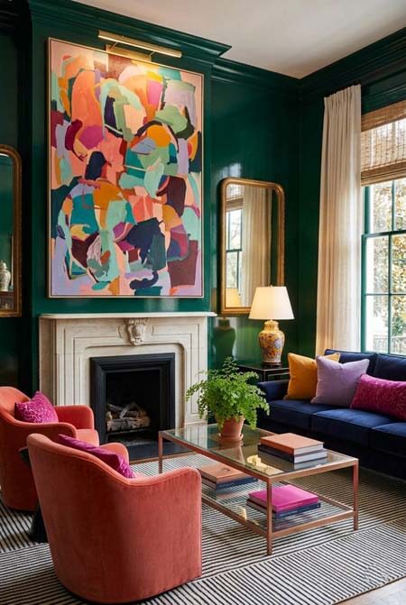 Colorful modern living room - AI-assisted image | Human-editedJumping Off Point
Instead of just picking a lot of random colors for your room that you like, start with a color jumping off point that will help solidify your color scheme. Professional designers call this a "bridge".
This bridge item will help make your color selections look cohesive, intentional, and your room thoughtfully designed.
The bridge item should be one, or maybe 2, large items that have many colors.
You will use all or many of the colors in your bridge item for other decorative items in your room, so make sure you love it!
The bridge item could be a colorful rug, colorful artwork, or a colorful fabric used on a large furniture piece or curtains.
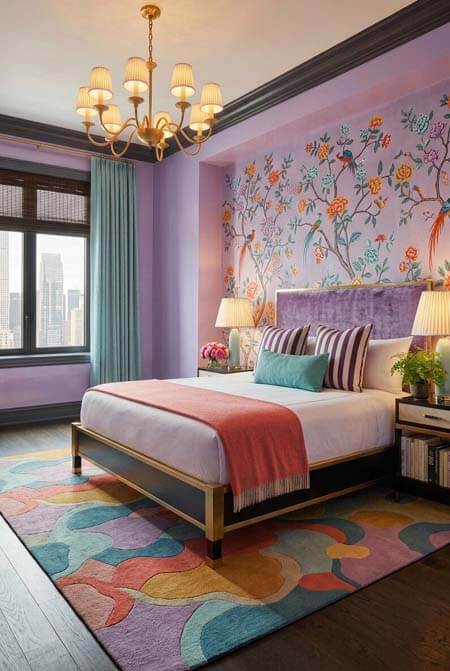 Modern lavender bedroom - AI-assisted image | Human-editedAvoid Primary Colors
Decorating your home exclusively with primary colors (basic red, blue, and yellow) can easily start to make your home look juvenile and basic. Decorating with one or two primary colors is fine, as long as you use them in combination with other more unique colors.
For a more mature and sophisticated color scheme, decorate your home using more complex colors that are less common and not found in a kindergarten classroom.
You might enjoy colors such as blush. robin's egg blue, marigold, burgundy, turquoise, aqua, sea green, coral, cranberry, emerald, coral, lavender, navy, eggplant, fuschia, teal, mauve, indigo, mocha, copper, and/or nectarine instead.
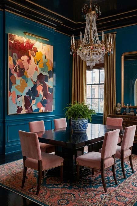 Navy blue and pink dining room - AI-assisted image | Human-editedColor Mixing
Instead of having all of your colors used in equal amounts, select one color to be the dominant color.
The dominant color should be used more than the other colors since using all of your colors in equal amounts can look a little too prescripted and feel boring.
Also consider having one secondary color to be used more than the other colors, excluding the dominant color.
The other colors can be used in smaller quantities on such items as accessories and smaller furniture pieces.
Pro designer tip - most designers like to follow a 60/30/10 concept where 60% of the room's color comes from the dominant color, 30% from the secondary color, and 10% from the 3rd accent color.
Also make sure to use different shades (darker versions = the color mixed with black) and tints (lighter versions = the color mixed with white) of your colors for a more complex and sophisticated color palette.
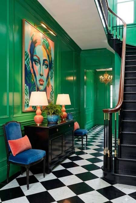 Dramatic colorful foyer with green walls and black and white floor - AI-assisted image | Human-editedAdd Black and White for Contrast
Well decorated rooms have a balance of dark, light, and mid toned colors for optimum contrast.
To check your room's contrast, take a photo of your room and convert it to black & white.
Your photo should look 10-25% black, 10-25% white, and 50-80% gray.
That doesn't mean that you need to decorate with black - dark colors like navy blue or charcoal gray should look black in a black & white photo. You also don't need to decorate with white - any very light color will look white in a black & white photo.
If your room looks all medium gray, then add dark and light accents to increase the contrast and make your room more visually pleasing.
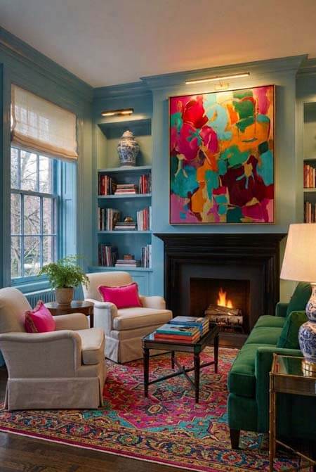 Colorful blue, green, and pink living room - AI-assisted image | Human-editedAvoid Busy Prints
When decorating with prints, designers typically use prints of different sizes so the patterns do not compete with themselves.
You can use one large scale print (maybe a floral), one medium scale print (maybe a stripe), and one small scale print (maybe a houndstooth).
Since you are using many colors, try to limit the amount of patterns that you use so that the color and pattern mixing does not look too overwhelming.
Solid colored textural items (velvet, linen, etc) tend to look best in very colorful rooms.
Small scale fabrics with many colors tend to look muddy from a distance and can make the room feel too overpowering and uninviting, especially when using several different small scale colorful fabrics.